
@ Matthew Mezinskis
2025-02-25 14:14:11
Another quarter, another update on the global money supply.
I remember three years ago yesterday, texting my Ukrainian friends for updates as they fled with their families for safety from Putin's full-scale, unprovoked attack on their country. Three years on, they continue to fight incredibly bravely, for if they do not, there will be no Ukraine. Europe has drip-fed them enough support to not lose, but not enough to win. America now demands repayment for its aid to the victim in the form of mineral rights, and will not recognize the aggressor as the aggressor. The era of Reagan-style, speak softly while carrying a big stick approach to dictators seems no more, for now, from the new US admin. The world order is changing rapidly, and Europe is quickly finding out what the Baltics and Poland have known for 200 years: the threat from the East does not share its values; it is simply uncompromising.
As this next round of political theater plays out, and one can only hope for just, lasting peace and security with clear eyes from all democratic allies, the printing presses will do as instructed. But as we look through this update, you will see that we are actually at very low, relative-levels of money printing historically, even slight negative money growth.
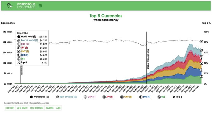
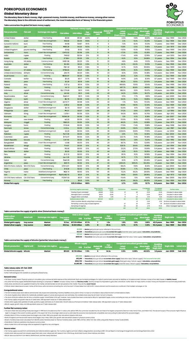
Bitcoin continues on, and as of 31 December 2024, its **$1.8 trillion market cap was 7.2% of the global monetary base**. That means that the global monetary base, for this update, is $25.5 trillion.
## **Why the global monetary base?**
It is the only money supply that is economically analogous to bitcoins, digital store of value today, and to gold and silver ounces, store of values from the past.
The monetary base is **central bank money**, comprised of two supplies:
1. **Physical currency**: Notes and coins, or “cash;”
2. **Bank reserves**: The “Master account” that each commercial bank holds with its central bank.
Now, why do I refer to this as *Central bank money*?
This is because, unlike all other money supplies in the fiduciary banking world (like M1/M2/M3), the Monetary base is the sole and ultimate money supply controlled by the central bank. It is, literally, the printing press. What follows won't be a lesson in reserve ratios or monetary economics. The point is that you simply understand that there is a money supply that central banks solely control, and of course (of course!) this is what Bitcoin's 21 million are up against.
The monetary base is to the core of the entire fiat financial system, as 21 million bitcoins are to the core of the Bitcoin protocol. One is open and permissionless, and one is not. By the way, the monetary base is essentially (though not entirely) analogous to the total liabilities of a central bank, so we can (basically) say that the monetary base is the "balance sheet" of each central bank.
**On cash**. Quick notes on the above. Certainly you understand what "cash" is, and it is indeed an instrument that has been fully monopolized by each central bank in each nation around the world--only they can print it. Even though it is true that banks in more free banking societies in the past could freely print and strike notes and coins, the central bank (or state) monopoly has been around for a long time. Kublai Khan was the first to do it 750 years ago.
**On bank reserves**. Don't stress your brain on this too much, but this is the main "settlement money" that banks use between each other, when they want to settle their debts. It is digital now (Fedwire in US, CHAPS in UK), but it doesn't technically have to be, and of course before modern technology took over even a few decades ago, it was not. These two stacks of retail and wholesale cash, stacks of central bank money, are what make up the **Monetary base**. *This is the printing press*. Only this compares to 21 million bitcoins. And gold, and silver by the way.
Final note, central bank digital currencies, or CBDCs, which are simply LARPing on Bitcoin's success, are indeed created by central banks, and they are indeed classified as Base money. They are going to be a "third rail." They are thankfully incredibly small, pilot projects today. We will see how far democracies will be tested, as autocracies no doubt will mainstream them; but for now, consider them, at least economically, to be inconsequential to the update below. It appears that central banks are actually cooling to them, as of this writing.
With that review out of the way, onward to Q4 update for 2024.
## **Bitcoin is the 6th largest money in the world**
This is unchanged from last quarter.
In February 2024, it surpassed the monetary base of the United Kingdom; that is, its value was larger than the Bank of England's balance sheet, and it remains so to this day.
As of 31 December 2024, it is only the balance sheets of the big four central banks that are larger than Bitcoin. These currencies are:
1. **Federal Reserve (dollar)**: $5.60 trillion
2. **People's Bank of China (yuan)**: $5.04 trillion equivalent
3. **European Central Bank (euro)**: $4.87 trillion equivalent
4. **Bank of Japan (yen)**: $4.20 trillion equivalent
If we remove gold from the equation (and we shouldn't), then Bitcoin could be considered the fifth largest money in the world. Including gold, Bitcoin is the sixth.
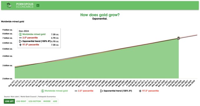
However, the all-important monetary metal throughout history that even a child knows about--gold--is still king at around **$17 trillion in value**, or 6 billion ounces worldwide. Note, this does not include gold lost/recycled through industry; in that case, it is estimated that about 7 billion ounces of gold have been mined throughout humanity.
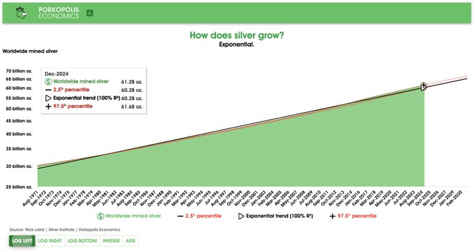
Silver, for what it's worth, is still a big "monetary" metal; though it is true, much more silver is gobbled up in industry compared to gold. There are about 31 billion ounces of non-industrial silver floating around the world (most of it in jewelry and silverware form) that is valued in today's prices at nearly $1 trillion. Bitcoin bigger.
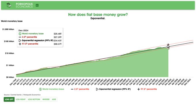
## **State of the print: $25.5 trillion**
This is down $1.5 trillion from last quarter!
However, we must also remember that as currencies lose value against the best-looking horse in the glue factory; that is, the dollar, then this dollar value actually "dampens" the effect of the print. More on this below.
If we consider **$25.5 trillion as the Big Boss** of central bank money, then Bitcoin at $1.8 trillion network value (December, quarter-end figure) indeed has some way to go. But as anyone who follows Bitcoin for a sustained about of time knows, this can change rapidly. We can also imagine how the Pareto distribution occurs even in money, if Bitcoin after only 15 years is already larger than every central bank money in the world except for four of them. Wild to ponder.
## **All-time supply (monetary) inflation: 12.7% per year compounded**
This is a long-term, "smoothed" monetary inflation, or money growth figure. It is looking across all the 50 currencies in my sample, going back to 31 December 1969 for almost 40% of them, and for those that don't, simply adding them into the weighted basket as data becomes available.
Roughly stated, it means that central banks on balance double their money supply every 5.8 years. This is a fact.
However, this overall rate of increase is indeed declining, and has been since 2022. For example, if we looked at this headline figure from last year ending 2023, it blended to **12.9% all-time, or 0.2% higher than now**. Still, even though central banks have been trying to tighten from their overheated 2020-22 money print, the overall, net effects of money growth **in native fiat units** have not changed significantly.
For more detail, we can look at the latest year.
## **Trailing 12-month money growth: -3.0%**
What is very interesting, however, and alluded to above, is how all global currencies continue to decline in *relative value against the dollar*. According to the simple, USD-based trendline analysis for all global currencies in the dataset (see below), we should have a $34 trillion monetary base right now, based on past performance. We have a $25.5 trillion monetary base right now. We are actually *lower than the 2.5th percentile* on this trendline.
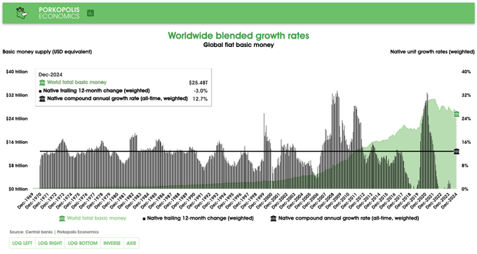But take note: What you are really seeing is actually *not that much less of money printing* (they have been letting up the gas, to be sure), but rather, a tremendous loss in purchasing power of all currencies versus the dollar!
In other words, from 2023 to 2024:
1. The weighted average, native change in money base growth of all currencies was **-3.0% over the prior 12 months**;
2. The overall dollar value change was **-8.5% over the prior 12 months ($25.5 trillion vs. $27.8 trillion)**.
This means that, in the last year, government money lost an **additional 5.5% per year in dollar purchasing power**, beyond its reduction of 3.0% in money print. Wild.
## **Since 2021 peak**
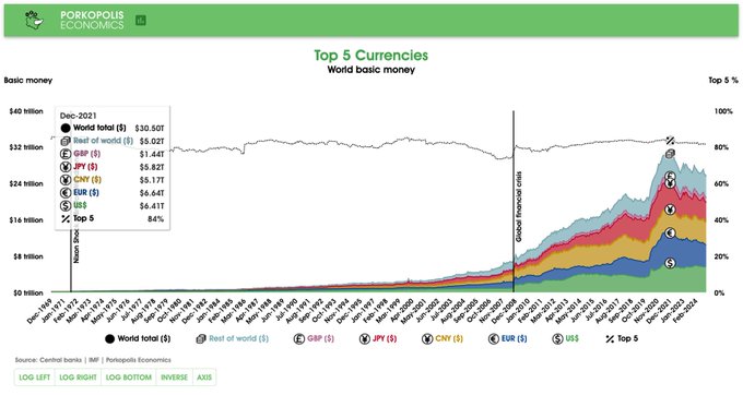
I don't publicize this information as much, and I probably should. In dollar terms, in December 2021, global central bank money printing **peaked at $30.5 trillion**. Big number. Now, it is $25.5 trillion. So one would assume that the printing presses have cooled by 16.4% in the last three years.
But again, as I have just described above, we are trying to see beyond Wittgenstein's Ruler here. This can be difficult, because we have 50 different currencies to contend with.
It is true, in the last three years, the **dollar value** of the top 50 currencies in the world has fallen by 16.4%.
*But does that mean that central banks are printing 16.4% less than before 2021?*
No.
In fact, when you look at the weighted average of each central bank's performance over the last three years, in their *native currency units*, you will find **that the weighted average decline in printing is only 2.4%**.
Notice anything? This decrease over three years is actually *less* than the decline over the last 12 months, which was 3.0% (section above).
And most obviously, **it is far less than 16.4%**.
There are dollar values. These grow differently from all the **native currency units**, because of foreign exchange rates.
**There are native currency units**. These grow differently from all the dollar values of these currencies, because of foreign exchange rates.
Central banks are printing less over the last three years: **2.4% less overall**. But this is much less than the decline in the dollar value of 50 currency stocks over the last three years: **16.4% decline**.
One must tear through the numbers to understand both ideas. I have provided you with both.
## **New data: China**
Firstly, what I am about to say has nothing to do with what I've described above, except for a very small impact on the overall, headline figure of 12.7% money growth. This is a historical addition.
I have added some important new monetary data this quarter, and that is from the quasi-transparent yet enormous economy of China. On the PBoC website, they publish balance sheet data back to only 31 December 1999. I have used this timespan for seven years now in my quarterly updates. However, I have now gone through some new figures from the book *China Financial Statistics (1949-2005)* and added additional data points all the way back to 1969 for China. It is published from PBoC sources. I am using M0 figures from 1969 until 1993 (only available, very compatible, as a subset of base money), and from 1993, they begin publishing full monetary base data. The break in growth metrics when switching from M0 to MB in 1993 is ignored.
The changes from this new data--from a huge, growing economy such as China will, as expected, boost the overall inflation numbers in my dataset. These are the net effects of the new data, as of 31 December 2024:
**China Monetary base average monthly growth for entire series:**
1. Old data from 1999: 0.85%
2. New data from 1969: 1.04%
**China Monetary base compound annual growth for entire series:**
1. Old data from 1999: 10.73%
2. New data from 1969: 14.24%
**Overall Monetary base compound annual growth for entire series:**
1. Before this additional China data: 12.56%
2. After this additional China data: 12.73%
So the net effect on "global monetary inflation" with this additional data is 17 basis points, or 0.17%. I thought the overall effect could be higher, but one must remember these growth rates are weighted by the *relative USD value of each respective base money*, on a continuous basis, updating each month. In the 1960s, 1970s, and 1980s, China was a much smaller proportion of the global economic pie than it is today.
One final point with this new data, and with my monetary inflation data overall. I am fairly confident my headline number of **12.6-12.7% per year compounded** for global money growth is *conservative*. These are the top 50 currencies in the world. We just saw what new data did to the entire dataset, and from a huge country no less. If I were to add more currencies, such as those from Kenya or Morocco (and I will), these currencies will only marginally affect this headline money growth figure. What's more, this new data will by definition come from ***smaller, more volatile, higher inflation-producing*** currencies, so I would only expect my headline figure to creep higher, the further it is refined.
***Huge thanks to Eryn @reltbracco (npub1e2rd2k45ym2jmctnysfadxumrvrr57vqj69ck6trt2y62c40r0kqs9lx8t) for sifting through tons of Chinese historical content here, and for eventually finding a great book with Chinese historical monetary data that was in English!***
## **The trends**
The remainder of the report is an update on global trends in demographics, money, and economics. All of these trends are **exponential curves**. The sole exception, is Bitcoin. It's price and market cap action, across time, are **power curves**.
One further change. I have allowed the 2.5 and 97.5 red percentile bands to evolve over time. I think this presentation allows the reader to see that trends indeed can change, across time. However, **the all-time trendline**, as of today, is the solid, black trendline.
We are where we are. Plan accordingly, never financial advice.
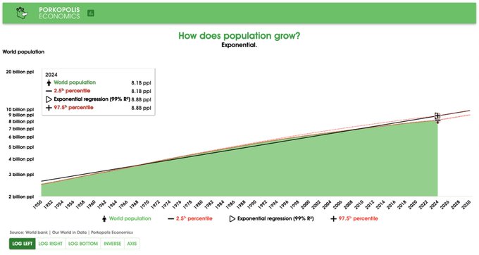
## **Population**
The world has grown exponentially at **1.7% per year** over the last 75 years. However, despite all the overpopulation myths you've probably heard, this rate of growth is actually falling, well below trend, and we only grow at **0.9% per year** at the moment, pulling the overall trend down every year.
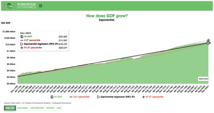
## **US GDP**
The United States has grown its economy at 5.2% compounded per year since the founding of the republic. We are at the higher end of this trend right now, $29 trillion output per year, growing at **5.3% per year**. As this is exponential growth, if I put it on log scale, it will become a straight line.
## **Stock market**
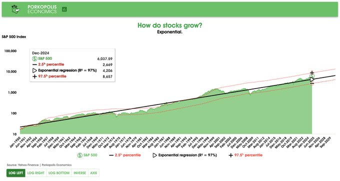
Stocks grow exponentially as well, don't let anyone tell you otherwise. The growth rate is **7.3% per year** for the S&P 500, the main US index that tracks more than 80% of total market caps. Currently, the market is well above trend.
## **Stock market: Dividends reinvested**
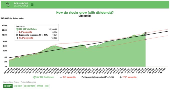
*If you reinvest those dividends* into the same stock market, you'll earn more. The all-time compound annual growth increases by 2% to **9.3% per year** for the S&P.
## **Bonds**
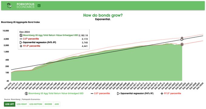
Bonds are supposedly safer than stocks (bondholders get paid back first), and more regular cash flowing. If you look at the longest running bond index in the US, it grows at **7.0% per year**, compounded. Notice how, in a rising interest rate environment (which we are in at the moment), bond prices will suffer. In this case, it's the Bloomberg Aggregate Bond Index. This has kept the bond market returns at the lower end of the range, since the global financial crisis in 2008. Not even 1% TTM return.
## **Base Money**
As we've discussed, base money grows across the world at a weighted average of **12.7% compounded per year**. However, this trendline analysis looks at it differently than my headline figure. It simply looks at the USD value of the global monetary base (again, currently **$25.5 trillion**), and draws an exponential trendline on that USD equivalent growth for 50+ years. In other words, this is going to be *after all currency fluctuations* have played themselves out.
**Slope of the trend is 10.2% compounded for this one.**
This is further confirmation that, even though central banks around the world like to print at 12.7% compounded all-time in native unit terms, they will always lose value against the world's reserve currency, as that shakes out to around 10.2% compounded in USD-terms.
And we really are scraping the bottom of this range. 0.7x the trendline, which
## **Silver supply**
This is total ounces ever mined. They trend upward at **1.4% per year**.
## **Gold supply**
This is total ounces ever mined. Gold trends upward at **1.7% per year**. Faster than silver. Surprised? Notice the R-squared (goodness of fit) for both silver and gold production increase.
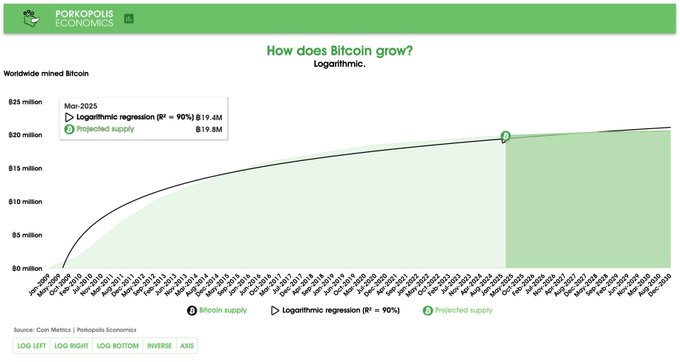
## **Bitcoin supply**
Bitcoins grow according to a basic logarithmic curve. Trying to draw percentiles is pointless here, and even measuring a trendline is relatively pointless, as everyone knows the bitcoins prescribed into the future, per the protocol. Better to just quote the trailing 12-month growth figure, and it is **1.2% per year** and falling, as of quarter end Dec-2024. Less than gold or silver.
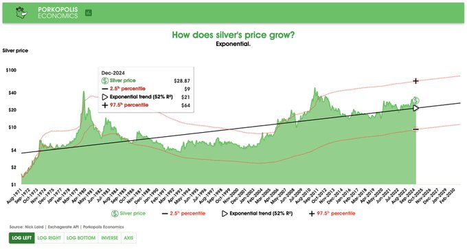
## **Silver price**
Since 1971 it's trended at 3.5% per year. Silver bug?
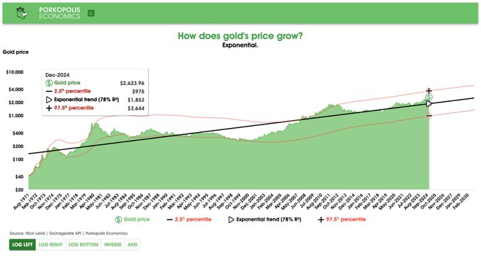
## **Gold price**
Since 1971 it's trended at 5.1% per year. Gold bug?
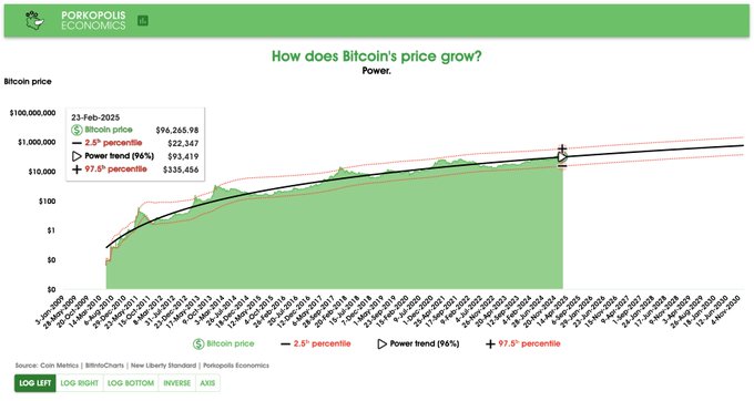
## **Bitcoin price**
Bitcoin's price (and market cap) grows according to a power trend. Did you notice that the prior exponential trends displayed themselves as straight lines on log scale? Well, with Bitcoin, the power trendline gradually falls across time, but the growth is still well larger than anything we've covered thus far. Now, we have finally arrived at something that grows differently than exponential.
[As I've observed since 2018](https://x.com/1basemoney/status/1079740420438011905)
.
Why? Because you are viewing an *adoption curve*. This is how networks scale.
Bitcoin's power trendline has grown **164% per year** since Bitcoin Pizza Day in 2010. Note that this is something akin to a "Lifetime Achievement" figure, and it will continue to fall every day. Over the prior 12 months ending 31-Dec-2024, Bitcoin grew **121.1%.** The compound growth of the power trend today is just under **44% per year**. By 2030 it will fall to "only" **31% per year**. You can find more dissection of the
[power curve on my website here](https://www.porkopolis.io/thechart/)
.
Oh yes, and it is free (as in speech), open, and permissionless money.
## **To summarize**
That was a lot of data across a lot of charts. I've compiled all these trendlines and data in a helpful table here for you to review at any time. These are the growth trends of the monetary and major asset world, as of year-end 2024:
Again, a quick breakdown on why Bitcoin is so interesting, and confounding. Where most things in the financial and economic world grow *exponentially*, Bitcoin is actually a compilation of *three* different trend patterns:
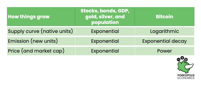## **Conclusion**
Below is a detailed summary of all the input assets:
1. 50 fiat currencies: $25.5 trillion
2. Gold: $17.1 trillion
3. Silver: $1 trillion
4. Bitcoin: $1.8 trillion
Print it out if you like!
Thank you for reading. This takes a lot of time to put together each quarter. If you enjoyed, please consider zapping, and you can also donate to my [BTCPay](https://donations.cryptovoices.com/) on [my website](https://www.porkopolis.io/) if you'd like to help keep this research going.
Take care.